Energy usage & generation patterns
Solar generation & energy consumption patterns around the world
How much of a typical home’s 25 kWh/day electricity use can a
6.6 kW rooftop solar system cover — and how does that change
with a battery, across seasons, and around the globe?
We modelled 28 cities to find out.
All numbers use the same system size and consumption profile so you can compare like-for-like.
For country-specific pricing, tariffs, and battery economics, follow the links to our
location guides .
Comparison table
City
Country
Lat
Generation (kWh/kW/day)
6.6 kW system
Gen / consumption
Self-sufficiency (no battery)
Self-sufficiency (+ 5 kWh)
Self-sufficiency (+ 8 kWh)
Self-sufficiency (+ 12 kWh)
Lowest
Avg
Highest
Spread
Low
Avg
High
Grid import
Low
Avg
High
Low
Avg
High
Low
Avg
High
Low
Avg
High
Low
Avg
High
Phoenix
United States
33.4°N
4.8December
5.7
6.4June
28%
31.7 kWh
37.6 kWh
42.2 kWh
13.2 kWh
127%
150%
169%
~37.4%
~47.0%
~54.5%
~65.9%
~75.4%
~82.7%
~83.0%
~89.1%
~94.0%
~99.9%
~100.0%
~100.0%
Manila
Philippines
14.6°N
4.2December
4.6
4.9September
18%
27.4 kWh
30.2 kWh
32.4 kWh
13.7 kWh
110%
121%
130%
~42.2%
~45.3%
~47.8%
~70.7%
~73.7%
~76.2%
~86.9%
~88.0%
~89.1%
~100.0%
~100.0%
~100.0%
Sydney
Australia
33.9°S
3.4June
4.3
4.8October
42%
22.5 kWh
28.3 kWh
31.8 kWh
13.8 kWh
90%
113%
127%
~35.6%
~44.9%
~53.4%
~64.1%
~73.3%
~81.6%
~81.2%
~87.8%
~93.0%
~99.9%
~100.0%
~100.0%
Tokyo
Japan
35.7°N
2.9January
3.7
4.3August
38%
19.1 kWh
24.4 kWh
28.4 kWh
13.9 kWh
76%
98%
114%
~31.6%
~44.3%
~56.7%
~60.0%
~72.8%
~85.6%
~77.1%
~88.3%
~97.0%
~95.1%
~98.8%
~100.0%
London
United Kingdom
51.5°N
1.2December
2.8
4.5June
118%
7.9 kWh
18.5 kWh
29.7 kWh
14.3 kWh
32%
74%
119%
~22.2%
~42.7%
~63.4%
~39.8%
~68.1%
~90.7%
~45.5%
~79.3%
~100.0%
~53.1%
~85.0%
~100.0%
Reykjavík
Iceland
64.2°N
0.5December
2.4
4.8June
181%
3.0 kWh
15.8 kWh
31.7 kWh
15.2 kWh
12%
63%
127%
~11.7%
~39.3%
~64.7%
~21.2%
~62.7%
~91.5%
~26.9%
~69.8%
~100.0%
~34.5%
~75.5%
~100.0%
City
Country
Lat
Generation (kWh/kW/day)
6.6 kW system
Gen / consumption
Self-sufficiency (no battery)
Self-sufficiency (+ 5 kWh)
Self-sufficiency (+ 8 kWh)
Self-sufficiency (+ 12 kWh)
Lowest
Avg
Highest
Spread
Low
Avg
High
Grid import
Low
Avg
High
Low
Avg
High
Low
Avg
High
Low
Avg
High
Low
Avg
High
Phoenix
United States
33.4°N
4.8December
5.7
6.4June
28%
31.7 kWh
37.6 kWh
42.2 kWh
13.2 kWh
127%
150%
169%
~37.4%
~47.0%
~54.5%
~65.9%
~75.4%
~82.7%
~83.0%
~89.1%
~94.0%
~99.9%
~100.0%
~100.0%
Delhi
India
28.6°N
3.5July
4.8
5.7April
46%
23.1 kWh
31.7 kWh
37.6 kWh
13.6 kWh
92%
127%
150%
~35.8%
~45.8%
~54.0%
~64.2%
~74.2%
~82.2%
~81.3%
~88.3%
~93.6%
~99.9%
~100.0%
~100.0%
Manila
Philippines
14.6°N
4.2December
4.6
4.9September
18%
27.4 kWh
30.2 kWh
32.4 kWh
13.7 kWh
110%
121%
130%
~42.2%
~45.3%
~47.8%
~70.7%
~73.7%
~76.2%
~86.9%
~88.0%
~89.1%
~100.0%
~100.0%
~100.0%
Bangkok
Thailand
13.8°N
4.2December
4.6
4.9September
18%
27.5 kWh
30.2 kWh
32.5 kWh
13.7 kWh
110%
121%
130%
~42.3%
~45.3%
~47.8%
~70.7%
~73.8%
~76.2%
~86.9%
~88.0%
~89.1%
~100.0%
~100.0%
~100.0%
Mumbai
India
19.1°N
4.0December
4.5
4.9September
22%
26.5 kWh
29.9 kWh
32.3 kWh
13.6 kWh
106%
120%
129%
~36.4%
~45.5%
~53.4%
~64.9%
~73.9%
~81.6%
~82.0%
~88.2%
~93.0%
~99.9%
~100.0%
~100.0%
Mexico City
Mexico
19.4°N
4.0December
4.5
4.9September
22%
26.5 kWh
29.9 kWh
32.3 kWh
13.6 kWh
106%
120%
129%
~36.4%
~45.5%
~53.4%
~64.9%
~73.9%
~81.6%
~82.0%
~88.2%
~93.0%
~99.9%
~100.0%
~100.0%
Hanoi
Vietnam
21.0°N
4.0December
4.5
4.9April
23%
26.2 kWh
29.8 kWh
32.2 kWh
13.6 kWh
105%
119%
129%
~36.4%
~45.5%
~53.4%
~64.8%
~73.8%
~81.6%
~81.9%
~88.1%
~93.0%
~99.9%
~100.0%
~100.0%
Madrid
Spain
40.4°N
3.4December
4.5
5.5July
47%
22.4 kWh
29.7 kWh
36.3 kWh
13.3 kWh
90%
119%
145%
~32.4%
~46.6%
~59.4%
~60.8%
~74.9%
~87.6%
~77.9%
~89.6%
~99.0%
~98.2%
~99.5%
~100.0%
Nairobi
Kenya
1.3°S
4.2July
4.5
4.7February
11%
27.7 kWh
29.7 kWh
31.0 kWh
13.8 kWh
111%
119%
124%
~42.4%
~45.1%
~47.4%
~70.8%
~73.5%
~75.8%
~86.9%
~88.0%
~88.9%
~100.0%
~100.0%
~100.0%
São Paulo
Brazil
23.6°S
3.9June
4.5
4.9October
26%
25.6 kWh
29.5 kWh
32.2 kWh
13.6 kWh
102%
118%
129%
~36.3%
~45.3%
~53.4%
~64.7%
~73.7%
~81.6%
~81.8%
~88.1%
~93.0%
~99.9%
~100.0%
~100.0%
Brisbane
Australia
27.5°S
3.7June
4.4
4.9October
31%
24.5 kWh
29.1 kWh
32.1 kWh
13.7 kWh
98%
116%
128%
~36.0%
~45.1%
~53.4%
~64.5%
~73.6%
~81.6%
~81.6%
~88.0%
~93.0%
~99.9%
~100.0%
~100.0%
Houston
United States
29.7°N
3.6December
4.4
4.9April
34%
24.0 kWh
29.0 kWh
32.0 kWh
13.7 kWh
96%
116%
128%
~35.9%
~45.1%
~53.4%
~64.4%
~73.5%
~81.6%
~81.5%
~88.0%
~93.0%
~99.9%
~100.0%
~100.0%
Lahore
Pakistan
31.5°N
3.5December
4.4
4.8April
37%
23.3 kWh
28.7 kWh
31.9 kWh
13.7 kWh
93%
115%
128%
~35.8%
~45.1%
~53.4%
~64.3%
~73.4%
~81.6%
~81.3%
~87.9%
~93.0%
~99.9%
~100.0%
~100.0%
Los Angeles
United States
34.1°N
3.4December
4.3
4.8April
42%
22.4 kWh
28.4 kWh
31.8 kWh
13.8 kWh
90%
114%
127%
~35.6%
~44.9%
~53.4%
~64.1%
~73.3%
~81.6%
~81.2%
~87.8%
~93.0%
~99.8%
~100.0%
~100.0%
Cape Town
South Africa
33.9°S
3.4June
4.3
4.8October
40%
22.7 kWh
28.4 kWh
31.8 kWh
13.8 kWh
91%
114%
127%
~35.7%
~44.9%
~53.4%
~64.1%
~73.3%
~81.6%
~81.2%
~87.8%
~93.0%
~99.9%
~100.0%
~100.0%
Santiago
Chile
33.4°S
3.5June
4.3
4.8October
40%
22.8 kWh
28.4 kWh
31.9 kWh
13.8 kWh
91%
114%
128%
~35.7%
~44.9%
~53.4%
~64.2%
~73.3%
~81.6%
~81.3%
~87.9%
~93.0%
~99.9%
~100.0%
~100.0%
Sydney
Australia
33.9°S
3.4June
4.3
4.8October
42%
22.5 kWh
28.3 kWh
31.8 kWh
13.8 kWh
90%
113%
127%
~35.6%
~44.9%
~53.4%
~64.1%
~73.3%
~81.6%
~81.2%
~87.8%
~93.0%
~99.9%
~100.0%
~100.0%
Melbourne
Australia
37.8°S
3.2June
4.2
4.8February
48%
21.3 kWh
27.8 kWh
31.7 kWh
13.6 kWh
85%
111%
127%
~32.1%
~45.7%
~58.2%
~60.6%
~74.1%
~86.4%
~77.6%
~89.0%
~97.8%
~98.1%
~99.5%
~100.0%
Lagos
Nigeria
6.5°N
3.9August
4.2
4.5January
14%
25.7 kWh
27.7 kWh
29.7 kWh
13.9 kWh
103%
111%
119%
~41.6%
~44.4%
~47.0%
~70.0%
~72.8%
~75.5%
~86.8%
~87.8%
~88.7%
~100.0%
~100.0%
~100.0%
Beijing
China
39.9°N
2.6December
4.2
5.5May
69%
17.2 kWh
27.7 kWh
36.3 kWh
13.6 kWh
69%
111%
145%
~31.1%
~45.7%
~59.4%
~59.6%
~74.1%
~87.6%
~76.6%
~89.0%
~99.0%
~87.9%
~97.0%
~100.0%
New York
United States
40.7°N
3.0December
4.1
4.7August
57%
20.0 kWh
27.3 kWh
31.3 kWh
13.7 kWh
80%
109%
125%
~31.8%
~45.5%
~58.2%
~60.2%
~73.8%
~86.3%
~77.3%
~88.8%
~97.7%
~97.9%
~99.5%
~100.0%
Tokyo
Japan
35.7°N
2.9January
3.7
4.3August
38%
19.1 kWh
24.4 kWh
28.4 kWh
13.9 kWh
76%
98%
114%
~31.6%
~44.3%
~56.7%
~60.0%
~72.8%
~85.6%
~77.1%
~88.3%
~97.0%
~95.1%
~98.8%
~100.0%
Toronto
Canada
43.7°N
1.6December
3.4
5.0July
100%
10.6 kWh
22.4 kWh
33.0 kWh
14.2 kWh
42%
90%
132%
~27.4%
~43.1%
~58.6%
~50.4%
~70.2%
~86.8%
~56.1%
~83.0%
~98.2%
~63.7%
~90.9%
~100.0%
Vancouver
Canada
49.3°N
1.0December
3.1
5.2July
135%
6.6 kWh
20.5 kWh
34.3 kWh
14.6 kWh
26%
82%
137%
~23.7%
~41.8%
~58.9%
~35.7%
~66.0%
~87.1%
~41.4%
~78.9%
~98.5%
~49.0%
~87.2%
~100.0%
Stockholm
Sweden
59.3°N
0.9December
3.0
5.4June
150%
5.9 kWh
19.8 kWh
35.6 kWh
14.2 kWh
24%
79%
142%
~20.9%
~43.6%
~66.6%
~32.7%
~67.4%
~93.2%
~38.4%
~79.0%
~100.0%
~46.0%
~85.7%
~100.0%
Moscow
Russia
55.8°N
0.9December
2.9
5.2June
147%
6.3 kWh
19.1 kWh
34.3 kWh
14.2 kWh
25%
76%
137%
~21.2%
~43.3%
~66.0%
~33.9%
~67.4%
~92.7%
~39.6%
~79.0%
~100.0%
~47.2%
~84.8%
~100.0%
London
United Kingdom
51.5°N
1.2December
2.8
4.5June
118%
7.9 kWh
18.5 kWh
29.7 kWh
14.3 kWh
32%
74%
119%
~22.2%
~42.7%
~63.4%
~39.8%
~68.1%
~90.7%
~45.5%
~79.3%
~100.0%
~53.1%
~85.0%
~100.0%
Reykjavík
Iceland
64.2°N
0.5December
2.4
4.8June
181%
3.0 kWh
15.8 kWh
31.7 kWh
15.2 kWh
12%
63%
127%
~11.7%
~39.3%
~64.7%
~21.2%
~62.7%
~91.5%
~26.9%
~69.8%
~100.0%
~34.5%
~75.5%
~100.0%
Showing 6 representative cities — desert, tropical, Southern Hemisphere, East Asia, mid-latitude, and subarctic.
Show all 28 locations (full table & charts)
Show 6 representative locations only
What the numbers tell us
The table above compresses a lot of information. Here’s how to read the key metrics
and what they mean for a real household.
Generation vs consumption — the starting point
The Gen / Consumption column is the simplest measure: how much
energy does your system produce relative to what your home uses on an average day?
Phoenix generates 150% of its daily consumption — more than enough on paper.
Reykjavík manages 63%.
But this headline number hides two things: when the energy is generated versus
when it’s needed, and how much that ratio swings across seasons .
Self-sufficiency — what you actually use
Even Phoenix, at 150% generation, only achieves roughly 47% self-sufficiency
without a battery. More than half the solar is produced when you don’t need it (midday
surplus), while you need power when there is none (evening and night).
This is why the self-sufficiency column matters more than total generation for bill impact.
Self-sufficiency differs from self-consumption , which measures how much of your
generated solar you use rather than export. A low-generation location like London
can have very high self-consumption — nearly all the solar gets used — yet
still depend on the grid for most of its energy. Self-sufficiency tells the real story.
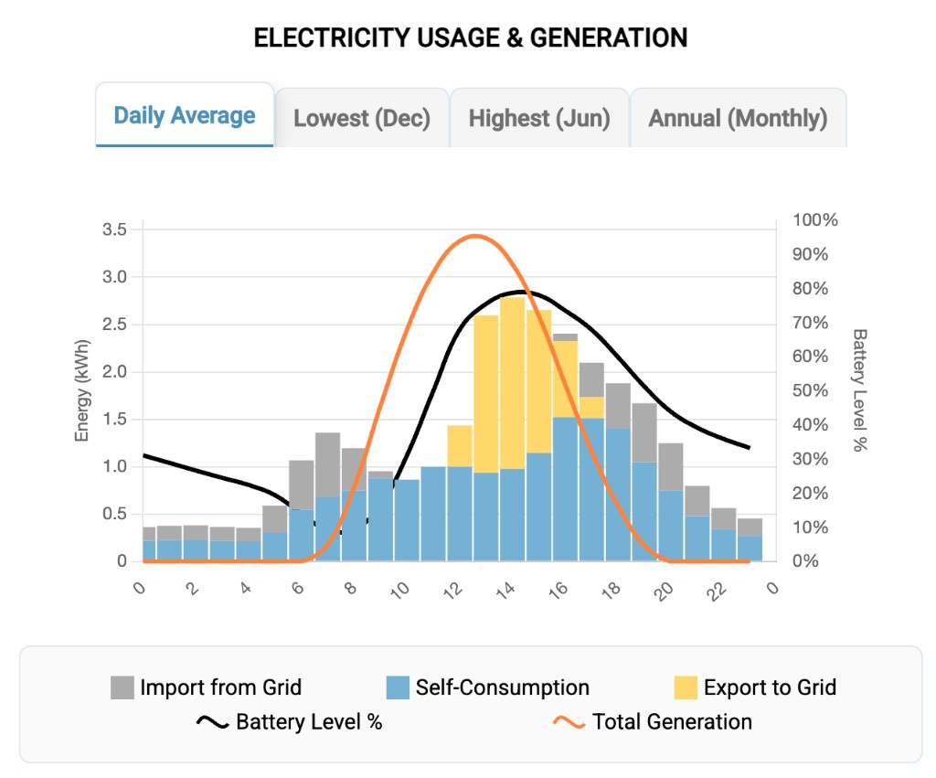
How batteries change the equation
A battery captures midday surplus and releases it in the evening — directly boosting
self-sufficiency. The table compares 5, 8 and 12 kWh batteries
alongside a no-battery baseline (all using 90% round-trip efficiency and 50% starting charge).
The jump from no battery to a 5 kWh battery is the biggest single
improvement: Phoenix leaps from 47% to 75%, London from 43% to 68%.
Scaling to 8 kWh pushes further (Phoenix 89%, London 79%),
and 12 kWh gets sunny cities close to 100%.
But high-latitude cities hit diminishing returns — Reykjavík caps around 76%
with 12 kWh because there simply isn’t enough winter generation to store.
The seasonal breakdown in the table shows exactly where this ceiling appears for each city.
Below is an example from the Photonik app showing how energy flows through the day with
a battery — charging from solar during the day and powering your home through the evening.
The seasonal story
Near the equator (Manila, Bangkok, Nairobi) — generation barely
changes between best and worst month. Seasonal spread stays under 20% and self-sufficiency
is consistent year-round. What you see in the annual average is what you get every month.
Subtropical and desert cities (Phoenix, Brisbane, Madrid) — strong
year-round output with a moderate seasonal swing (28–47%). Good economics in both
seasons, and batteries make a big impact because there is enough winter sun to store.
High-latitude cities (London, Stockholm, Reykjavík) —
enormous seasonal swings (118–181%). Summer self-sufficiency can rival the tropics
(Reykjavík hits 65% in its best month), but winter drops to 11–22%.
This is the real challenge for northern solar: not bad annual numbers, but a deep winter
trough that batteries alone cannot bridge.
Which calendar month is “lowest” or “highest” depends on hemisphere
and local climate — check the month labels in the table and chart titles.
What this means for your electricity bill
Self-sufficiency translates directly to bill reduction: 47% self-sufficiency means roughly
47% less electricity purchased from the grid. But the value of that saving depends
on local electricity prices — a 47% cut in Australia (high tariffs) saves more money
than 47% in parts of India (lower tariffs). See our
solar savings & payback by country
for pricing context.
Heating and cooling matter too. Homes with electric heating use far more in winter —
precisely when solar is weakest in temperate climates. Homes with heavy air conditioning
use more in summer, when solar is strongest. Your actual consumption profile shifts these
numbers significantly.
This model uses a flat 25 kWh/day profile.
Your real home will differ — the
Photonik savings calculator
uses your actual address, roof, and tariff to personalise these numbers and show you exactly
what solar and a battery would save at your home.
Reading the charts
Orange curve: modelled solar power through the day for that profile.Blue curve: typical residential consumption shape (totals 25 kWh/day).Yellow / blue fills: solar production and consumption envelopes; where they overlap, more energy is used on-site.Lowest / Highest use your location pipeline’s typical worst and best calendar months (kWh/kW/day) plus a day-length curve for that latitude. Annual average blends the year.
Representative locations (charts)
Phoenix, United States (Desert; 33.4°N)
Lowest — December
0:00
6:00
12:00
18:00
24:00
0.0 kW
1.0 kW
2.0 kW
3.0 kW
4.0 kW
5.0 kW
Solar (4.8 kWh/kW/day)
Consumption (25 kWh/day)
Highest — June
0:00
6:00
12:00
18:00
24:00
0.0 kW
1.0 kW
2.0 kW
3.0 kW
4.0 kW
5.0 kW
Solar (6.4 kWh/kW/day)
Consumption (25 kWh/day)
Annual average
0:00
6:00
12:00
18:00
24:00
0.0 kW
1.0 kW
2.0 kW
3.0 kW
4.0 kW
5.0 kW
Solar (5.7 kWh/kW/day)
Consumption (25 kWh/day)
Daily generation (6.6 kW) 31.7 kWh (December) · 37.6 kWh (avg) · 42.2 kWh (June)
Generation vs consumption 127% (December) · 150% (avg) · 169% (June)
Self-sufficiency — no battery ~37.4% (December) · ~48.0% (avg) · ~54.5% (June)
Self-sufficiency — + 5 kWh battery ~65.9% (December) · ~76.5% (avg) · ~82.7% (June)
Self-sufficiency — + 8 kWh battery ~83.0% (December) · ~89.7% (avg) · ~94.0% (June)
Self-sufficiency — + 12 kWh battery ~99.9% (December) · ~100.0% (avg) · ~100.0% (June)
Grid import — weighted avg 13.2 kWh (no battery) · 6.2 kWh (+5) · 2.8 kWh (+8) · 0.0 kWh (+12)
Typical daylight window (avg) 7:00am – 5:00pm
Seasonal variation 28%
Manila, Philippines (Tropical; 14.6°N)
Lowest — December
0:00
6:00
12:00
18:00
24:00
0.0 kW
1.0 kW
2.0 kW
3.0 kW
4.0 kW
5.0 kW
Solar (4.2 kWh/kW/day)
Consumption (25 kWh/day)
Highest — September
0:00
6:00
12:00
18:00
24:00
0.0 kW
1.0 kW
2.0 kW
3.0 kW
4.0 kW
5.0 kW
Solar (4.9 kWh/kW/day)
Consumption (25 kWh/day)
Annual average
0:00
6:00
12:00
18:00
24:00
0.0 kW
1.0 kW
2.0 kW
3.0 kW
4.0 kW
5.0 kW
Solar (4.6 kWh/kW/day)
Consumption (25 kWh/day)
Daily generation (6.6 kW) 27.4 kWh (December) · 30.2 kWh (avg) · 32.4 kWh (September)
Generation vs consumption 110% (December) · 121% (avg) · 130% (September)
Self-sufficiency — no battery ~42.2% (December) · ~45.6% (avg) · ~47.8% (September)
Self-sufficiency — + 5 kWh battery ~70.7% (December) · ~74.0% (avg) · ~76.2% (September)
Self-sufficiency — + 8 kWh battery ~86.9% (December) · ~88.0% (avg) · ~89.1% (September)
Self-sufficiency — + 12 kWh battery ~100.0% (December) · ~100.0% (avg) · ~100.0% (September)
Grid import — weighted avg 13.7 kWh (no battery) · 6.6 kWh (+5) · 3.0 kWh (+8) · 0.0 kWh (+12)
Typical daylight window (avg) 7:00am – 5:00pm
Seasonal variation 18%
Sydney, Australia (Temperate; 33.9°S)
Lowest — June
0:00
6:00
12:00
18:00
24:00
0.0 kW
1.0 kW
2.0 kW
3.0 kW
4.0 kW
5.0 kW
Solar (3.4 kWh/kW/day)
Consumption (25 kWh/day)
Highest — October
0:00
6:00
12:00
18:00
24:00
0.0 kW
1.0 kW
2.0 kW
3.0 kW
4.0 kW
5.0 kW
Solar (4.8 kWh/kW/day)
Consumption (25 kWh/day)
Annual average
0:00
6:00
12:00
18:00
24:00
0.0 kW
1.0 kW
2.0 kW
3.0 kW
4.0 kW
5.0 kW
Solar (4.3 kWh/kW/day)
Consumption (25 kWh/day)
Daily generation (6.6 kW) 22.5 kWh (June) · 28.3 kWh (avg) · 31.8 kWh (October)
Generation vs consumption 90% (June) · 113% (avg) · 127% (October)
Self-sufficiency — no battery ~35.6% (June) · ~45.3% (avg) · ~53.4% (October)
Self-sufficiency — + 5 kWh battery ~64.1% (June) · ~73.7% (avg) · ~81.6% (October)
Self-sufficiency — + 8 kWh battery ~81.2% (June) · ~88.6% (avg) · ~93.0% (October)
Self-sufficiency — + 12 kWh battery ~99.9% (June) · ~100.0% (avg) · ~100.0% (October)
Grid import — weighted avg 13.8 kWh (no battery) · 6.7 kWh (+5) · 3.1 kWh (+8) · 0.0 kWh (+12)
Typical daylight window (avg) 7:00am – 5:00pm
Seasonal variation 42%
Tokyo, Japan (Humid subtropical; 35.7°N)
Lowest — January
0:00
6:00
12:00
18:00
24:00
0.0 kW
1.0 kW
2.0 kW
3.0 kW
4.0 kW
5.0 kW
Solar (2.9 kWh/kW/day)
Consumption (25 kWh/day)
Highest — August
0:00
6:00
12:00
18:00
24:00
0.0 kW
1.0 kW
2.0 kW
3.0 kW
4.0 kW
5.0 kW
Solar (4.3 kWh/kW/day)
Consumption (25 kWh/day)
Annual average
0:00
6:00
12:00
18:00
24:00
0.0 kW
1.0 kW
2.0 kW
3.0 kW
4.0 kW
5.0 kW
Solar (3.7 kWh/kW/day)
Consumption (25 kWh/day)
Daily generation (6.6 kW) 19.1 kWh (January) · 24.4 kWh (avg) · 28.4 kWh (August)
Generation vs consumption 76% (January) · 98% (avg) · 114% (August)
Self-sufficiency — no battery ~31.6% (January) · ~44.4% (avg) · ~56.7% (August)
Self-sufficiency — + 5 kWh battery ~60.0% (January) · ~72.8% (avg) · ~85.6% (August)
Self-sufficiency — + 8 kWh battery ~77.1% (January) · ~89.6% (avg) · ~97.0% (August)
Self-sufficiency — + 12 kWh battery ~95.1% (January) · ~100.0% (avg) · ~100.0% (August)
Grid import — weighted avg 13.9 kWh (no battery) · 6.8 kWh (+5) · 2.9 kWh (+8) · 0.3 kWh (+12)
Typical daylight window (avg) 7:00am – 6:00pm
Seasonal variation 38%
London, United Kingdom (Temperate maritime; 51.5°N)
Lowest — December
0:00
6:00
12:00
18:00
24:00
0.0 kW
1.0 kW
2.0 kW
3.0 kW
4.0 kW
5.0 kW
Solar (1.2 kWh/kW/day)
Consumption (25 kWh/day)
Highest — June
0:00
6:00
12:00
18:00
24:00
0.0 kW
1.0 kW
2.0 kW
3.0 kW
4.0 kW
5.0 kW
Solar (4.5 kWh/kW/day)
Consumption (25 kWh/day)
Annual average
0:00
6:00
12:00
18:00
24:00
0.0 kW
1.0 kW
2.0 kW
3.0 kW
4.0 kW
5.0 kW
Solar (2.8 kWh/kW/day)
Consumption (25 kWh/day)
Daily generation (6.6 kW) 7.9 kWh (December) · 18.5 kWh (avg) · 29.7 kWh (June)
Generation vs consumption 32% (December) · 74% (avg) · 119% (June)
Self-sufficiency — no battery ~22.2% (December) · ~42.6% (avg) · ~63.4% (June)
Self-sufficiency — + 5 kWh battery ~39.8% (December) · ~71.0% (avg) · ~90.7% (June)
Self-sufficiency — + 8 kWh battery ~45.5% (December) · ~85.8% (avg) · ~100.0% (June)
Self-sufficiency — + 12 kWh battery ~53.1% (December) · ~93.4% (avg) · ~100.0% (June)
Grid import — weighted avg 14.3 kWh (no battery) · 7.9 kWh (+5) · 5.2 kWh (+8) · 3.7 kWh (+12)
Typical daylight window (avg) 7:00am – 6:00pm
Seasonal variation 118%
Reykjavík, Iceland (Subarctic oceanic; 64.2°N)
Lowest — December
0:00
6:00
12:00
18:00
24:00
0.0 kW
1.0 kW
2.0 kW
3.0 kW
4.0 kW
5.0 kW
Solar (0.5 kWh/kW/day)
Consumption (25 kWh/day)
Highest — June
0:00
6:00
12:00
18:00
24:00
0.0 kW
1.0 kW
2.0 kW
3.0 kW
4.0 kW
5.0 kW
Solar (4.8 kWh/kW/day)
Consumption (25 kWh/day)
Annual average
0:00
6:00
12:00
18:00
24:00
0.0 kW
1.0 kW
2.0 kW
3.0 kW
4.0 kW
5.0 kW
Solar (2.4 kWh/kW/day)
Consumption (25 kWh/day)
Daily generation (6.6 kW) 3.0 kWh (December) · 15.8 kWh (avg) · 31.7 kWh (June)
Generation vs consumption 12% (December) · 63% (avg) · 127% (June)
Self-sufficiency — no battery ~11.7% (December) · ~40.5% (avg) · ~64.7% (June)
Self-sufficiency — + 5 kWh battery ~21.2% (December) · ~69.0% (avg) · ~91.5% (June)
Self-sufficiency — + 8 kWh battery ~26.9% (December) · ~76.2% (avg) · ~100.0% (June)
Self-sufficiency — + 12 kWh battery ~34.5% (December) · ~83.7% (avg) · ~100.0% (June)
Grid import — weighted avg 15.2 kWh (no battery) · 9.3 kWh (+5) · 7.6 kWh (+8) · 6.1 kWh (+12)
Typical daylight window (avg) 7:00am – 6:00pm
Seasonal variation 181%
Show all 28 locations (full table & charts)
Australia & Oceania
Brisbane, Australia (Subtropical; 27.5°S)
Lowest — June
0:00
6:00
12:00
18:00
24:00
0.0 kW
1.0 kW
2.0 kW
3.0 kW
4.0 kW
5.0 kW
Solar (3.7 kWh/kW/day)
Consumption (25 kWh/day)
Highest — October
0:00
6:00
12:00
18:00
24:00
0.0 kW
1.0 kW
2.0 kW
3.0 kW
4.0 kW
5.0 kW
Solar (4.9 kWh/kW/day)
Consumption (25 kWh/day)
Annual average
0:00
6:00
12:00
18:00
24:00
0.0 kW
1.0 kW
2.0 kW
3.0 kW
4.0 kW
5.0 kW
Solar (4.4 kWh/kW/day)
Consumption (25 kWh/day)
Daily generation (6.6 kW) 24.5 kWh (June) · 29.1 kWh (avg) · 32.1 kWh (October)
Generation vs consumption 98% (June) · 116% (avg) · 128% (October)
Self-sufficiency — no battery ~36.0% (June) · ~45.6% (avg) · ~53.4% (October)
Self-sufficiency — + 5 kWh battery ~64.5% (June) · ~74.1% (avg) · ~81.6% (October)
Self-sufficiency — + 8 kWh battery ~81.6% (June) · ~88.7% (avg) · ~93.0% (October)
Self-sufficiency — + 12 kWh battery ~99.9% (June) · ~100.0% (avg) · ~100.0% (October)
Grid import — weighted avg 13.7 kWh (no battery) · 6.6 kWh (+5) · 3.0 kWh (+8) · 0.0 kWh (+12)
Typical daylight window (avg) 7:00am – 5:00pm
Seasonal variation 31%
Sydney, Australia (Temperate; 33.9°S)
Lowest — June
0:00
6:00
12:00
18:00
24:00
0.0 kW
1.0 kW
2.0 kW
3.0 kW
4.0 kW
5.0 kW
Solar (3.4 kWh/kW/day)
Consumption (25 kWh/day)
Highest — October
0:00
6:00
12:00
18:00
24:00
0.0 kW
1.0 kW
2.0 kW
3.0 kW
4.0 kW
5.0 kW
Solar (4.8 kWh/kW/day)
Consumption (25 kWh/day)
Annual average
0:00
6:00
12:00
18:00
24:00
0.0 kW
1.0 kW
2.0 kW
3.0 kW
4.0 kW
5.0 kW
Solar (4.3 kWh/kW/day)
Consumption (25 kWh/day)
Daily generation (6.6 kW) 22.5 kWh (June) · 28.3 kWh (avg) · 31.8 kWh (October)
Generation vs consumption 90% (June) · 113% (avg) · 127% (October)
Self-sufficiency — no battery ~35.6% (June) · ~45.3% (avg) · ~53.4% (October)
Self-sufficiency — + 5 kWh battery ~64.1% (June) · ~73.7% (avg) · ~81.6% (October)
Self-sufficiency — + 8 kWh battery ~81.2% (June) · ~88.6% (avg) · ~93.0% (October)
Self-sufficiency — + 12 kWh battery ~99.9% (June) · ~100.0% (avg) · ~100.0% (October)
Grid import — weighted avg 13.8 kWh (no battery) · 6.7 kWh (+5) · 3.1 kWh (+8) · 0.0 kWh (+12)
Typical daylight window (avg) 7:00am – 5:00pm
Seasonal variation 42%
Melbourne, Australia (Temperate; 37.8°S)
Lowest — June
0:00
6:00
12:00
18:00
24:00
0.0 kW
1.0 kW
2.0 kW
3.0 kW
4.0 kW
5.0 kW
Solar (3.2 kWh/kW/day)
Consumption (25 kWh/day)
Highest — February
0:00
6:00
12:00
18:00
24:00
0.0 kW
1.0 kW
2.0 kW
3.0 kW
4.0 kW
5.0 kW
Solar (4.8 kWh/kW/day)
Consumption (25 kWh/day)
Annual average
0:00
6:00
12:00
18:00
24:00
0.0 kW
1.0 kW
2.0 kW
3.0 kW
4.0 kW
5.0 kW
Solar (4.2 kWh/kW/day)
Consumption (25 kWh/day)
Daily generation (6.6 kW) 21.3 kWh (June) · 27.8 kWh (avg) · 31.7 kWh (February)
Generation vs consumption 85% (June) · 111% (avg) · 127% (February)
Self-sufficiency — no battery ~32.1% (June) · ~46.2% (avg) · ~58.2% (February)
Self-sufficiency — + 5 kWh battery ~60.6% (June) · ~74.6% (avg) · ~86.4% (February)
Self-sufficiency — + 8 kWh battery ~77.6% (June) · ~90.3% (avg) · ~97.8% (February)
Self-sufficiency — + 12 kWh battery ~98.1% (June) · ~100.0% (avg) · ~100.0% (February)
Grid import — weighted avg 13.6 kWh (no battery) · 6.5 kWh (+5) · 2.7 kWh (+8) · 0.1 kWh (+12)
Typical daylight window (avg) 7:00am – 6:00pm
Seasonal variation 48%
South & Southeast Asia
Manila, Philippines (Tropical; 14.6°N)
Lowest — December
0:00
6:00
12:00
18:00
24:00
0.0 kW
1.0 kW
2.0 kW
3.0 kW
4.0 kW
5.0 kW
Solar (4.2 kWh/kW/day)
Consumption (25 kWh/day)
Highest — September
0:00
6:00
12:00
18:00
24:00
0.0 kW
1.0 kW
2.0 kW
3.0 kW
4.0 kW
5.0 kW
Solar (4.9 kWh/kW/day)
Consumption (25 kWh/day)
Annual average
0:00
6:00
12:00
18:00
24:00
0.0 kW
1.0 kW
2.0 kW
3.0 kW
4.0 kW
5.0 kW
Solar (4.6 kWh/kW/day)
Consumption (25 kWh/day)
Daily generation (6.6 kW) 27.4 kWh (December) · 30.2 kWh (avg) · 32.4 kWh (September)
Generation vs consumption 110% (December) · 121% (avg) · 130% (September)
Self-sufficiency — no battery ~42.2% (December) · ~45.6% (avg) · ~47.8% (September)
Self-sufficiency — + 5 kWh battery ~70.7% (December) · ~74.0% (avg) · ~76.2% (September)
Self-sufficiency — + 8 kWh battery ~86.9% (December) · ~88.0% (avg) · ~89.1% (September)
Self-sufficiency — + 12 kWh battery ~100.0% (December) · ~100.0% (avg) · ~100.0% (September)
Grid import — weighted avg 13.7 kWh (no battery) · 6.6 kWh (+5) · 3.0 kWh (+8) · 0.0 kWh (+12)
Typical daylight window (avg) 7:00am – 5:00pm
Seasonal variation 18%
Bangkok, Thailand (Tropical; 13.8°N)
Lowest — December
0:00
6:00
12:00
18:00
24:00
0.0 kW
1.0 kW
2.0 kW
3.0 kW
4.0 kW
5.0 kW
Solar (4.2 kWh/kW/day)
Consumption (25 kWh/day)
Highest — September
0:00
6:00
12:00
18:00
24:00
0.0 kW
1.0 kW
2.0 kW
3.0 kW
4.0 kW
5.0 kW
Solar (4.9 kWh/kW/day)
Consumption (25 kWh/day)
Annual average
0:00
6:00
12:00
18:00
24:00
0.0 kW
1.0 kW
2.0 kW
3.0 kW
4.0 kW
5.0 kW
Solar (4.6 kWh/kW/day)
Consumption (25 kWh/day)
Daily generation (6.6 kW) 27.5 kWh (December) · 30.2 kWh (avg) · 32.5 kWh (September)
Generation vs consumption 110% (December) · 121% (avg) · 130% (September)
Self-sufficiency — no battery ~42.3% (December) · ~45.6% (avg) · ~47.8% (September)
Self-sufficiency — + 5 kWh battery ~70.7% (December) · ~74.1% (avg) · ~76.2% (September)
Self-sufficiency — + 8 kWh battery ~86.9% (December) · ~88.0% (avg) · ~89.1% (September)
Self-sufficiency — + 12 kWh battery ~100.0% (December) · ~100.0% (avg) · ~100.0% (September)
Grid import — weighted avg 13.7 kWh (no battery) · 6.6 kWh (+5) · 3.0 kWh (+8) · 0.0 kWh (+12)
Typical daylight window (avg) 7:00am – 5:00pm
Seasonal variation 18%
Hanoi, Vietnam (Subtropical humid; 21.0°N)
Lowest — December
0:00
6:00
12:00
18:00
24:00
0.0 kW
1.0 kW
2.0 kW
3.0 kW
4.0 kW
5.0 kW
Solar (4.0 kWh/kW/day)
Consumption (25 kWh/day)
Highest — April
0:00
6:00
12:00
18:00
24:00
0.0 kW
1.0 kW
2.0 kW
3.0 kW
4.0 kW
5.0 kW
Solar (4.9 kWh/kW/day)
Consumption (25 kWh/day)
Annual average
0:00
6:00
12:00
18:00
24:00
0.0 kW
1.0 kW
2.0 kW
3.0 kW
4.0 kW
5.0 kW
Solar (4.5 kWh/kW/day)
Consumption (25 kWh/day)
Daily generation (6.6 kW) 26.2 kWh (December) · 29.8 kWh (avg) · 32.2 kWh (April)
Generation vs consumption 105% (December) · 119% (avg) · 129% (April)
Self-sufficiency — no battery ~36.4% (December) · ~46.0% (avg) · ~53.4% (April)
Self-sufficiency — + 5 kWh battery ~64.8% (December) · ~74.4% (avg) · ~81.6% (April)
Self-sufficiency — + 8 kWh battery ~81.9% (December) · ~88.8% (avg) · ~93.0% (April)
Self-sufficiency — + 12 kWh battery ~99.9% (December) · ~100.0% (avg) · ~100.0% (April)
Grid import — weighted avg 13.6 kWh (no battery) · 6.6 kWh (+5) · 2.9 kWh (+8) · 0.0 kWh (+12)
Typical daylight window (avg) 7:00am – 5:00pm
Seasonal variation 23%
Mumbai, India (Tropical monsoon; 19.1°N)
Lowest — December
0:00
6:00
12:00
18:00
24:00
0.0 kW
1.0 kW
2.0 kW
3.0 kW
4.0 kW
5.0 kW
Solar (4.0 kWh/kW/day)
Consumption (25 kWh/day)
Highest — September
0:00
6:00
12:00
18:00
24:00
0.0 kW
1.0 kW
2.0 kW
3.0 kW
4.0 kW
5.0 kW
Solar (4.9 kWh/kW/day)
Consumption (25 kWh/day)
Annual average
0:00
6:00
12:00
18:00
24:00
0.0 kW
1.0 kW
2.0 kW
3.0 kW
4.0 kW
5.0 kW
Solar (4.5 kWh/kW/day)
Consumption (25 kWh/day)
Daily generation (6.6 kW) 26.5 kWh (December) · 29.9 kWh (avg) · 32.3 kWh (September)
Generation vs consumption 106% (December) · 120% (avg) · 129% (September)
Self-sufficiency — no battery ~36.4% (December) · ~46.0% (avg) · ~53.4% (September)
Self-sufficiency — + 5 kWh battery ~64.9% (December) · ~74.5% (avg) · ~81.6% (September)
Self-sufficiency — + 8 kWh battery ~82.0% (December) · ~88.8% (avg) · ~93.0% (September)
Self-sufficiency — + 12 kWh battery ~99.9% (December) · ~100.0% (avg) · ~100.0% (September)
Grid import — weighted avg 13.6 kWh (no battery) · 6.6 kWh (+5) · 2.9 kWh (+8) · 0.0 kWh (+12)
Typical daylight window (avg) 7:00am – 5:00pm
Seasonal variation 22%
Delhi, India (Semi-arid; 28.6°N)
Lowest — July
0:00
6:00
12:00
18:00
24:00
0.0 kW
1.0 kW
2.0 kW
3.0 kW
4.0 kW
5.0 kW
Solar (3.5 kWh/kW/day)
Consumption (25 kWh/day)
Highest — April
0:00
6:00
12:00
18:00
24:00
0.0 kW
1.0 kW
2.0 kW
3.0 kW
4.0 kW
5.0 kW
Solar (5.7 kWh/kW/day)
Consumption (25 kWh/day)
Annual average
0:00
6:00
12:00
18:00
24:00
0.0 kW
1.0 kW
2.0 kW
3.0 kW
4.0 kW
5.0 kW
Solar (4.8 kWh/kW/day)
Consumption (25 kWh/day)
Daily generation (6.6 kW) 23.1 kWh (July) · 31.7 kWh (avg) · 37.6 kWh (April)
Generation vs consumption 92% (July) · 127% (avg) · 150% (April)
Self-sufficiency — no battery ~35.8% (July) · ~46.8% (avg) · ~54.0% (April)
Self-sufficiency — + 5 kWh battery ~64.2% (July) · ~75.3% (avg) · ~82.2% (April)
Self-sufficiency — + 8 kWh battery ~81.3% (July) · ~89.1% (avg) · ~93.6% (April)
Self-sufficiency — + 12 kWh battery ~99.9% (July) · ~100.0% (avg) · ~100.0% (April)
Grid import — weighted avg 13.6 kWh (no battery) · 6.5 kWh (+5) · 2.9 kWh (+8) · 0.0 kWh (+12)
Typical daylight window (avg) 7:00am – 5:00pm
Seasonal variation 46%
Lahore, Pakistan (Semi-arid; 31.5°N)
Lowest — December
0:00
6:00
12:00
18:00
24:00
0.0 kW
1.0 kW
2.0 kW
3.0 kW
4.0 kW
5.0 kW
Solar (3.5 kWh/kW/day)
Consumption (25 kWh/day)
Highest — April
0:00
6:00
12:00
18:00
24:00
0.0 kW
1.0 kW
2.0 kW
3.0 kW
4.0 kW
5.0 kW
Solar (4.8 kWh/kW/day)
Consumption (25 kWh/day)
Annual average
0:00
6:00
12:00
18:00
24:00
0.0 kW
1.0 kW
2.0 kW
3.0 kW
4.0 kW
5.0 kW
Solar (4.4 kWh/kW/day)
Consumption (25 kWh/day)
Daily generation (6.6 kW) 23.3 kWh (December) · 28.7 kWh (avg) · 31.9 kWh (April)
Generation vs consumption 93% (December) · 115% (avg) · 128% (April)
Self-sufficiency — no battery ~35.8% (December) · ~45.5% (avg) · ~53.4% (April)
Self-sufficiency — + 5 kWh battery ~64.3% (December) · ~73.9% (avg) · ~81.6% (April)
Self-sufficiency — + 8 kWh battery ~81.3% (December) · ~88.7% (avg) · ~93.0% (April)
Self-sufficiency — + 12 kWh battery ~99.9% (December) · ~100.0% (avg) · ~100.0% (April)
Grid import — weighted avg 13.7 kWh (no battery) · 6.6 kWh (+5) · 3.0 kWh (+8) · 0.0 kWh (+12)
Typical daylight window (avg) 7:00am – 5:00pm
Seasonal variation 37%
East Asia
Tokyo, Japan (Humid subtropical; 35.7°N)
Lowest — January
0:00
6:00
12:00
18:00
24:00
0.0 kW
1.0 kW
2.0 kW
3.0 kW
4.0 kW
5.0 kW
Solar (2.9 kWh/kW/day)
Consumption (25 kWh/day)
Highest — August
0:00
6:00
12:00
18:00
24:00
0.0 kW
1.0 kW
2.0 kW
3.0 kW
4.0 kW
5.0 kW
Solar (4.3 kWh/kW/day)
Consumption (25 kWh/day)
Annual average
0:00
6:00
12:00
18:00
24:00
0.0 kW
1.0 kW
2.0 kW
3.0 kW
4.0 kW
5.0 kW
Solar (3.7 kWh/kW/day)
Consumption (25 kWh/day)
Daily generation (6.6 kW) 19.1 kWh (January) · 24.4 kWh (avg) · 28.4 kWh (August)
Generation vs consumption 76% (January) · 98% (avg) · 114% (August)
Self-sufficiency — no battery ~31.6% (January) · ~44.4% (avg) · ~56.7% (August)
Self-sufficiency — + 5 kWh battery ~60.0% (January) · ~72.8% (avg) · ~85.6% (August)
Self-sufficiency — + 8 kWh battery ~77.1% (January) · ~89.6% (avg) · ~97.0% (August)
Self-sufficiency — + 12 kWh battery ~95.1% (January) · ~100.0% (avg) · ~100.0% (August)
Grid import — weighted avg 13.9 kWh (no battery) · 6.8 kWh (+5) · 2.9 kWh (+8) · 0.3 kWh (+12)
Typical daylight window (avg) 7:00am – 6:00pm
Seasonal variation 38%
Beijing, China (Continental monsoon; 39.9°N)
Lowest — December
0:00
6:00
12:00
18:00
24:00
0.0 kW
1.0 kW
2.0 kW
3.0 kW
4.0 kW
5.0 kW
Solar (2.6 kWh/kW/day)
Consumption (25 kWh/day)
Highest — May
0:00
6:00
12:00
18:00
24:00
0.0 kW
1.0 kW
2.0 kW
3.0 kW
4.0 kW
5.0 kW
Solar (5.5 kWh/kW/day)
Consumption (25 kWh/day)
Annual average
0:00
6:00
12:00
18:00
24:00
0.0 kW
1.0 kW
2.0 kW
3.0 kW
4.0 kW
5.0 kW
Solar (4.2 kWh/kW/day)
Consumption (25 kWh/day)
Daily generation (6.6 kW) 17.2 kWh (December) · 27.7 kWh (avg) · 36.3 kWh (May)
Generation vs consumption 69% (December) · 111% (avg) · 145% (May)
Self-sufficiency — no battery ~31.1% (December) · ~46.1% (avg) · ~59.4% (May)
Self-sufficiency — + 5 kWh battery ~59.6% (December) · ~74.6% (avg) · ~87.6% (May)
Self-sufficiency — + 8 kWh battery ~76.6% (December) · ~90.3% (avg) · ~99.0% (May)
Self-sufficiency — + 12 kWh battery ~87.9% (December) · ~100.0% (avg) · ~100.0% (May)
Grid import — weighted avg 13.6 kWh (no battery) · 6.5 kWh (+5) · 2.7 kWh (+8) · 0.8 kWh (+12)
Typical daylight window (avg) 7:00am – 6:00pm
Seasonal variation 69%
Europe
Madrid, Spain (Mediterranean; 40.4°N)
Lowest — December
0:00
6:00
12:00
18:00
24:00
0.0 kW
1.0 kW
2.0 kW
3.0 kW
4.0 kW
5.0 kW
Solar (3.4 kWh/kW/day)
Consumption (25 kWh/day)
Highest — July
0:00
6:00
12:00
18:00
24:00
0.0 kW
1.0 kW
2.0 kW
3.0 kW
4.0 kW
5.0 kW
Solar (5.5 kWh/kW/day)
Consumption (25 kWh/day)
Annual average
0:00
6:00
12:00
18:00
24:00
0.0 kW
1.0 kW
2.0 kW
3.0 kW
4.0 kW
5.0 kW
Solar (4.5 kWh/kW/day)
Consumption (25 kWh/day)
Daily generation (6.6 kW) 22.4 kWh (December) · 29.7 kWh (avg) · 36.3 kWh (July)
Generation vs consumption 90% (December) · 119% (avg) · 145% (July)
Self-sufficiency — no battery ~32.4% (December) · ~47.2% (avg) · ~59.4% (July)
Self-sufficiency — + 5 kWh battery ~60.8% (December) · ~75.7% (avg) · ~87.6% (July)
Self-sufficiency — + 8 kWh battery ~77.9% (December) · ~90.7% (avg) · ~99.0% (July)
Self-sufficiency — + 12 kWh battery ~98.2% (December) · ~100.0% (avg) · ~100.0% (July)
Grid import — weighted avg 13.3 kWh (no battery) · 6.3 kWh (+5) · 2.6 kWh (+8) · 0.1 kWh (+12)
Typical daylight window (avg) 7:00am – 6:00pm
Seasonal variation 47%
London, United Kingdom (Temperate maritime; 51.5°N)
Lowest — December
0:00
6:00
12:00
18:00
24:00
0.0 kW
1.0 kW
2.0 kW
3.0 kW
4.0 kW
5.0 kW
Solar (1.2 kWh/kW/day)
Consumption (25 kWh/day)
Highest — June
0:00
6:00
12:00
18:00
24:00
0.0 kW
1.0 kW
2.0 kW
3.0 kW
4.0 kW
5.0 kW
Solar (4.5 kWh/kW/day)
Consumption (25 kWh/day)
Annual average
0:00
6:00
12:00
18:00
24:00
0.0 kW
1.0 kW
2.0 kW
3.0 kW
4.0 kW
5.0 kW
Solar (2.8 kWh/kW/day)
Consumption (25 kWh/day)
Daily generation (6.6 kW) 7.9 kWh (December) · 18.5 kWh (avg) · 29.7 kWh (June)
Generation vs consumption 32% (December) · 74% (avg) · 119% (June)
Self-sufficiency — no battery ~22.2% (December) · ~42.6% (avg) · ~63.4% (June)
Self-sufficiency — + 5 kWh battery ~39.8% (December) · ~71.0% (avg) · ~90.7% (June)
Self-sufficiency — + 8 kWh battery ~45.5% (December) · ~85.8% (avg) · ~100.0% (June)
Self-sufficiency — + 12 kWh battery ~53.1% (December) · ~93.4% (avg) · ~100.0% (June)
Grid import — weighted avg 14.3 kWh (no battery) · 7.9 kWh (+5) · 5.2 kWh (+8) · 3.7 kWh (+12)
Typical daylight window (avg) 7:00am – 6:00pm
Seasonal variation 118%
Stockholm, Sweden (Northern temperate; 59.3°N)
Lowest — December
0:00
6:00
12:00
18:00
24:00
0.0 kW
1.0 kW
2.0 kW
3.0 kW
4.0 kW
5.0 kW
Solar (0.9 kWh/kW/day)
Consumption (25 kWh/day)
Highest — June
0:00
6:00
12:00
18:00
24:00
0.0 kW
1.0 kW
2.0 kW
3.0 kW
4.0 kW
5.0 kW
Solar (5.4 kWh/kW/day)
Consumption (25 kWh/day)
Annual average
0:00
6:00
12:00
18:00
24:00
0.0 kW
1.0 kW
2.0 kW
3.0 kW
4.0 kW
5.0 kW
Solar (3.0 kWh/kW/day)
Consumption (25 kWh/day)
Daily generation (6.6 kW) 5.9 kWh (December) · 19.8 kWh (avg) · 35.6 kWh (June)
Generation vs consumption 24% (December) · 79% (avg) · 142% (June)
Self-sufficiency — no battery ~20.9% (December) · ~43.4% (avg) · ~66.6% (June)
Self-sufficiency — + 5 kWh battery ~32.7% (December) · ~71.9% (avg) · ~93.2% (June)
Self-sufficiency — + 8 kWh battery ~38.4% (December) · ~88.9% (avg) · ~100.0% (June)
Self-sufficiency — + 12 kWh battery ~46.0% (December) · ~98.3% (avg) · ~100.0% (June)
Grid import — weighted avg 14.2 kWh (no battery) · 8.1 kWh (+5) · 5.2 kWh (+8) · 3.6 kWh (+12)
Typical daylight window (avg) 7:00am – 6:00pm
Seasonal variation 150%
Northern Eurasia
Moscow, Russia (Continental; 55.8°N)
Lowest — December
0:00
6:00
12:00
18:00
24:00
0.0 kW
1.0 kW
2.0 kW
3.0 kW
4.0 kW
5.0 kW
Solar (0.9 kWh/kW/day)
Consumption (25 kWh/day)
Highest — June
0:00
6:00
12:00
18:00
24:00
0.0 kW
1.0 kW
2.0 kW
3.0 kW
4.0 kW
5.0 kW
Solar (5.2 kWh/kW/day)
Consumption (25 kWh/day)
Annual average
0:00
6:00
12:00
18:00
24:00
0.0 kW
1.0 kW
2.0 kW
3.0 kW
4.0 kW
5.0 kW
Solar (2.9 kWh/kW/day)
Consumption (25 kWh/day)
Daily generation (6.6 kW) 6.3 kWh (December) · 19.1 kWh (avg) · 34.3 kWh (June)
Generation vs consumption 25% (December) · 76% (avg) · 137% (June)
Self-sufficiency — no battery ~21.2% (December) · ~43.0% (avg) · ~66.0% (June)
Self-sufficiency — + 5 kWh battery ~33.9% (December) · ~71.5% (avg) · ~92.7% (June)
Self-sufficiency — + 8 kWh battery ~39.6% (December) · ~88.3% (avg) · ~100.0% (June)
Self-sufficiency — + 12 kWh battery ~47.2% (December) · ~95.9% (avg) · ~100.0% (June)
Grid import — weighted avg 14.2 kWh (no battery) · 8.1 kWh (+5) · 5.2 kWh (+8) · 3.8 kWh (+12)
Typical daylight window (avg) 7:00am – 6:00pm
Seasonal variation 147%
Reykjavík, Iceland (Subarctic oceanic; 64.2°N)
Lowest — December
0:00
6:00
12:00
18:00
24:00
0.0 kW
1.0 kW
2.0 kW
3.0 kW
4.0 kW
5.0 kW
Solar (0.5 kWh/kW/day)
Consumption (25 kWh/day)
Highest — June
0:00
6:00
12:00
18:00
24:00
0.0 kW
1.0 kW
2.0 kW
3.0 kW
4.0 kW
5.0 kW
Solar (4.8 kWh/kW/day)
Consumption (25 kWh/day)
Annual average
0:00
6:00
12:00
18:00
24:00
0.0 kW
1.0 kW
2.0 kW
3.0 kW
4.0 kW
5.0 kW
Solar (2.4 kWh/kW/day)
Consumption (25 kWh/day)
Daily generation (6.6 kW) 3.0 kWh (December) · 15.8 kWh (avg) · 31.7 kWh (June)
Generation vs consumption 12% (December) · 63% (avg) · 127% (June)
Self-sufficiency — no battery ~11.7% (December) · ~40.5% (avg) · ~64.7% (June)
Self-sufficiency — + 5 kWh battery ~21.2% (December) · ~69.0% (avg) · ~91.5% (June)
Self-sufficiency — + 8 kWh battery ~26.9% (December) · ~76.2% (avg) · ~100.0% (June)
Self-sufficiency — + 12 kWh battery ~34.5% (December) · ~83.7% (avg) · ~100.0% (June)
Grid import — weighted avg 15.2 kWh (no battery) · 9.3 kWh (+5) · 7.6 kWh (+8) · 6.1 kWh (+12)
Typical daylight window (avg) 7:00am – 6:00pm
Seasonal variation 181%
North America
Phoenix, United States (Desert; 33.4°N)
Lowest — December
0:00
6:00
12:00
18:00
24:00
0.0 kW
1.0 kW
2.0 kW
3.0 kW
4.0 kW
5.0 kW
Solar (4.8 kWh/kW/day)
Consumption (25 kWh/day)
Highest — June
0:00
6:00
12:00
18:00
24:00
0.0 kW
1.0 kW
2.0 kW
3.0 kW
4.0 kW
5.0 kW
Solar (6.4 kWh/kW/day)
Consumption (25 kWh/day)
Annual average
0:00
6:00
12:00
18:00
24:00
0.0 kW
1.0 kW
2.0 kW
3.0 kW
4.0 kW
5.0 kW
Solar (5.7 kWh/kW/day)
Consumption (25 kWh/day)
Daily generation (6.6 kW) 31.7 kWh (December) · 37.6 kWh (avg) · 42.2 kWh (June)
Generation vs consumption 127% (December) · 150% (avg) · 169% (June)
Self-sufficiency — no battery ~37.4% (December) · ~48.0% (avg) · ~54.5% (June)
Self-sufficiency — + 5 kWh battery ~65.9% (December) · ~76.5% (avg) · ~82.7% (June)
Self-sufficiency — + 8 kWh battery ~83.0% (December) · ~89.7% (avg) · ~94.0% (June)
Self-sufficiency — + 12 kWh battery ~99.9% (December) · ~100.0% (avg) · ~100.0% (June)
Grid import — weighted avg 13.2 kWh (no battery) · 6.2 kWh (+5) · 2.8 kWh (+8) · 0.0 kWh (+12)
Typical daylight window (avg) 7:00am – 5:00pm
Seasonal variation 28%
Los Angeles, United States (Warm-summer Mediterranean; 34.1°N)
Lowest — December
0:00
6:00
12:00
18:00
24:00
0.0 kW
1.0 kW
2.0 kW
3.0 kW
4.0 kW
5.0 kW
Solar (3.4 kWh/kW/day)
Consumption (25 kWh/day)
Highest — April
0:00
6:00
12:00
18:00
24:00
0.0 kW
1.0 kW
2.0 kW
3.0 kW
4.0 kW
5.0 kW
Solar (4.8 kWh/kW/day)
Consumption (25 kWh/day)
Annual average
0:00
6:00
12:00
18:00
24:00
0.0 kW
1.0 kW
2.0 kW
3.0 kW
4.0 kW
5.0 kW
Solar (4.3 kWh/kW/day)
Consumption (25 kWh/day)
Daily generation (6.6 kW) 22.4 kWh (December) · 28.4 kWh (avg) · 31.8 kWh (April)
Generation vs consumption 90% (December) · 114% (avg) · 127% (April)
Self-sufficiency — no battery ~35.6% (December) · ~45.3% (avg) · ~53.4% (April)
Self-sufficiency — + 5 kWh battery ~64.1% (December) · ~73.7% (avg) · ~81.6% (April)
Self-sufficiency — + 8 kWh battery ~81.2% (December) · ~88.6% (avg) · ~93.0% (April)
Self-sufficiency — + 12 kWh battery ~99.8% (December) · ~100.0% (avg) · ~100.0% (April)
Grid import — weighted avg 13.8 kWh (no battery) · 6.7 kWh (+5) · 3.0 kWh (+8) · 0.0 kWh (+12)
Typical daylight window (avg) 7:00am – 5:00pm
Seasonal variation 42%
Houston, United States (Subtropical humid; 29.7°N)
Lowest — December
0:00
6:00
12:00
18:00
24:00
0.0 kW
1.0 kW
2.0 kW
3.0 kW
4.0 kW
5.0 kW
Solar (3.6 kWh/kW/day)
Consumption (25 kWh/day)
Highest — April
0:00
6:00
12:00
18:00
24:00
0.0 kW
1.0 kW
2.0 kW
3.0 kW
4.0 kW
5.0 kW
Solar (4.9 kWh/kW/day)
Consumption (25 kWh/day)
Annual average
0:00
6:00
12:00
18:00
24:00
0.0 kW
1.0 kW
2.0 kW
3.0 kW
4.0 kW
5.0 kW
Solar (4.4 kWh/kW/day)
Consumption (25 kWh/day)
Daily generation (6.6 kW) 24.0 kWh (December) · 29.0 kWh (avg) · 32.0 kWh (April)
Generation vs consumption 96% (December) · 116% (avg) · 128% (April)
Self-sufficiency — no battery ~35.9% (December) · ~45.6% (avg) · ~53.4% (April)
Self-sufficiency — + 5 kWh battery ~64.4% (December) · ~74.0% (avg) · ~81.6% (April)
Self-sufficiency — + 8 kWh battery ~81.5% (December) · ~88.7% (avg) · ~93.0% (April)
Self-sufficiency — + 12 kWh battery ~99.9% (December) · ~100.0% (avg) · ~100.0% (April)
Grid import — weighted avg 13.7 kWh (no battery) · 6.6 kWh (+5) · 3.0 kWh (+8) · 0.0 kWh (+12)
Typical daylight window (avg) 7:00am – 5:00pm
Seasonal variation 34%
New York, United States (Temperate continental; 40.7°N)
Lowest — December
0:00
6:00
12:00
18:00
24:00
0.0 kW
1.0 kW
2.0 kW
3.0 kW
4.0 kW
5.0 kW
Solar (3.0 kWh/kW/day)
Consumption (25 kWh/day)
Highest — August
0:00
6:00
12:00
18:00
24:00
0.0 kW
1.0 kW
2.0 kW
3.0 kW
4.0 kW
5.0 kW
Solar (4.7 kWh/kW/day)
Consumption (25 kWh/day)
Annual average
0:00
6:00
12:00
18:00
24:00
0.0 kW
1.0 kW
2.0 kW
3.0 kW
4.0 kW
5.0 kW
Solar (4.1 kWh/kW/day)
Consumption (25 kWh/day)
Daily generation (6.6 kW) 20.0 kWh (December) · 27.3 kWh (avg) · 31.3 kWh (August)
Generation vs consumption 80% (December) · 109% (avg) · 125% (August)
Self-sufficiency — no battery ~31.8% (December) · ~45.9% (avg) · ~58.2% (August)
Self-sufficiency — + 5 kWh battery ~60.2% (December) · ~74.4% (avg) · ~86.3% (August)
Self-sufficiency — + 8 kWh battery ~77.3% (December) · ~90.2% (avg) · ~97.7% (August)
Self-sufficiency — + 12 kWh battery ~97.9% (December) · ~100.0% (avg) · ~100.0% (August)
Grid import — weighted avg 13.7 kWh (no battery) · 6.5 kWh (+5) · 2.8 kWh (+8) · 0.1 kWh (+12)
Typical daylight window (avg) 7:00am – 6:00pm
Seasonal variation 57%
Vancouver, Canada (Oceanic temperate; 49.3°N)
Lowest — December
0:00
6:00
12:00
18:00
24:00
0.0 kW
1.0 kW
2.0 kW
3.0 kW
4.0 kW
5.0 kW
Solar (1.0 kWh/kW/day)
Consumption (25 kWh/day)
Highest — July
0:00
6:00
12:00
18:00
24:00
0.0 kW
1.0 kW
2.0 kW
3.0 kW
4.0 kW
5.0 kW
Solar (5.2 kWh/kW/day)
Consumption (25 kWh/day)
Annual average
0:00
6:00
12:00
18:00
24:00
0.0 kW
1.0 kW
2.0 kW
3.0 kW
4.0 kW
5.0 kW
Solar (3.1 kWh/kW/day)
Consumption (25 kWh/day)
Daily generation (6.6 kW) 6.6 kWh (December) · 20.5 kWh (avg) · 34.3 kWh (July)
Generation vs consumption 26% (December) · 82% (avg) · 137% (July)
Self-sufficiency — no battery ~23.7% (December) · ~42.3% (avg) · ~58.9% (July)
Self-sufficiency — + 5 kWh battery ~35.7% (December) · ~70.7% (avg) · ~87.1% (July)
Self-sufficiency — + 8 kWh battery ~41.4% (December) · ~87.8% (avg) · ~98.5% (July)
Self-sufficiency — + 12 kWh battery ~49.0% (December) · ~100.0% (avg) · ~100.0% (July)
Grid import — weighted avg 14.6 kWh (no battery) · 8.5 kWh (+5) · 5.3 kWh (+8) · 3.2 kWh (+12)
Typical daylight window (avg) 7:00am – 6:00pm
Seasonal variation 135%
Toronto, Canada (Humid continental; 43.7°N)
Lowest — December
0:00
6:00
12:00
18:00
24:00
0.0 kW
1.0 kW
2.0 kW
3.0 kW
4.0 kW
5.0 kW
Solar (1.6 kWh/kW/day)
Consumption (25 kWh/day)
Highest — July
0:00
6:00
12:00
18:00
24:00
0.0 kW
1.0 kW
2.0 kW
3.0 kW
4.0 kW
5.0 kW
Solar (5.0 kWh/kW/day)
Consumption (25 kWh/day)
Annual average
0:00
6:00
12:00
18:00
24:00
0.0 kW
1.0 kW
2.0 kW
3.0 kW
4.0 kW
5.0 kW
Solar (3.4 kWh/kW/day)
Consumption (25 kWh/day)
Daily generation (6.6 kW) 10.6 kWh (December) · 22.4 kWh (avg) · 33.0 kWh (July)
Generation vs consumption 42% (December) · 90% (avg) · 132% (July)
Self-sufficiency — no battery ~27.4% (December) · ~43.3% (avg) · ~58.6% (July)
Self-sufficiency — + 5 kWh battery ~50.4% (December) · ~71.8% (avg) · ~86.8% (July)
Self-sufficiency — + 8 kWh battery ~56.1% (December) · ~88.8% (avg) · ~98.2% (July)
Self-sufficiency — + 12 kWh battery ~63.7% (December) · ~100.0% (avg) · ~100.0% (July)
Grid import — weighted avg 14.2 kWh (no battery) · 7.5 kWh (+5) · 4.3 kWh (+8) · 2.3 kWh (+12)
Typical daylight window (avg) 7:00am – 6:00pm
Seasonal variation 100%
Africa
Lagos, Nigeria (Tropical; 6.5°N)
Lowest — August
0:00
6:00
12:00
18:00
24:00
0.0 kW
1.0 kW
2.0 kW
3.0 kW
4.0 kW
5.0 kW
Solar (3.9 kWh/kW/day)
Consumption (25 kWh/day)
Highest — January
0:00
6:00
12:00
18:00
24:00
0.0 kW
1.0 kW
2.0 kW
3.0 kW
4.0 kW
5.0 kW
Solar (4.5 kWh/kW/day)
Consumption (25 kWh/day)
Annual average
0:00
6:00
12:00
18:00
24:00
0.0 kW
1.0 kW
2.0 kW
3.0 kW
4.0 kW
5.0 kW
Solar (4.2 kWh/kW/day)
Consumption (25 kWh/day)
Daily generation (6.6 kW) 25.7 kWh (August) · 27.7 kWh (avg) · 29.7 kWh (January)
Generation vs consumption 103% (August) · 111% (avg) · 119% (January)
Self-sufficiency — no battery ~41.6% (August) · ~44.4% (avg) · ~47.0% (January)
Self-sufficiency — + 5 kWh battery ~70.0% (August) · ~72.9% (avg) · ~75.5% (January)
Self-sufficiency — + 8 kWh battery ~86.8% (August) · ~87.8% (avg) · ~88.7% (January)
Self-sufficiency — + 12 kWh battery ~100.0% (August) · ~100.0% (avg) · ~100.0% (January)
Grid import — weighted avg 13.9 kWh (no battery) · 6.8 kWh (+5) · 3.1 kWh (+8) · 0.0 kWh (+12)
Typical daylight window (avg) 7:00am – 5:00pm
Seasonal variation 14%
Nairobi, Kenya (Tropical highland; 1.3°S)
Lowest — July
0:00
6:00
12:00
18:00
24:00
0.0 kW
1.0 kW
2.0 kW
3.0 kW
4.0 kW
5.0 kW
Solar (4.2 kWh/kW/day)
Consumption (25 kWh/day)
Highest — February
0:00
6:00
12:00
18:00
24:00
0.0 kW
1.0 kW
2.0 kW
3.0 kW
4.0 kW
5.0 kW
Solar (4.7 kWh/kW/day)
Consumption (25 kWh/day)
Annual average
0:00
6:00
12:00
18:00
24:00
0.0 kW
1.0 kW
2.0 kW
3.0 kW
4.0 kW
5.0 kW
Solar (4.5 kWh/kW/day)
Consumption (25 kWh/day)
Daily generation (6.6 kW) 27.7 kWh (July) · 29.7 kWh (avg) · 31.0 kWh (February)
Generation vs consumption 111% (July) · 119% (avg) · 124% (February)
Self-sufficiency — no battery ~42.4% (July) · ~45.3% (avg) · ~47.4% (February)
Self-sufficiency — + 5 kWh battery ~70.8% (July) · ~73.8% (avg) · ~75.8% (February)
Self-sufficiency — + 8 kWh battery ~86.9% (July) · ~88.0% (avg) · ~88.9% (February)
Self-sufficiency — + 12 kWh battery ~100.0% (July) · ~100.0% (avg) · ~100.0% (February)
Grid import — weighted avg 13.8 kWh (no battery) · 6.6 kWh (+5) · 3.0 kWh (+8) · 0.0 kWh (+12)
Typical daylight window (avg) 7:00am – 5:00pm
Seasonal variation 11%
Cape Town, South Africa (Mediterranean; 33.9°S)
Lowest — June
0:00
6:00
12:00
18:00
24:00
0.0 kW
1.0 kW
2.0 kW
3.0 kW
4.0 kW
5.0 kW
Solar (3.4 kWh/kW/day)
Consumption (25 kWh/day)
Highest — October
0:00
6:00
12:00
18:00
24:00
0.0 kW
1.0 kW
2.0 kW
3.0 kW
4.0 kW
5.0 kW
Solar (4.8 kWh/kW/day)
Consumption (25 kWh/day)
Annual average
0:00
6:00
12:00
18:00
24:00
0.0 kW
1.0 kW
2.0 kW
3.0 kW
4.0 kW
5.0 kW
Solar (4.3 kWh/kW/day)
Consumption (25 kWh/day)
Daily generation (6.6 kW) 22.7 kWh (June) · 28.4 kWh (avg) · 31.8 kWh (October)
Generation vs consumption 91% (June) · 114% (avg) · 127% (October)
Self-sufficiency — no battery ~35.7% (June) · ~45.3% (avg) · ~53.4% (October)
Self-sufficiency — + 5 kWh battery ~64.1% (June) · ~73.7% (avg) · ~81.6% (October)
Self-sufficiency — + 8 kWh battery ~81.2% (June) · ~88.6% (avg) · ~93.0% (October)
Self-sufficiency — + 12 kWh battery ~99.9% (June) · ~100.0% (avg) · ~100.0% (October)
Grid import — weighted avg 13.8 kWh (no battery) · 6.7 kWh (+5) · 3.1 kWh (+8) · 0.0 kWh (+12)
Typical daylight window (avg) 7:00am – 5:00pm
Seasonal variation 40%
Latin America
Mexico City, Mexico (Subtropical highland; 19.4°N)
Lowest — December
0:00
6:00
12:00
18:00
24:00
0.0 kW
1.0 kW
2.0 kW
3.0 kW
4.0 kW
5.0 kW
Solar (4.0 kWh/kW/day)
Consumption (25 kWh/day)
Highest — September
0:00
6:00
12:00
18:00
24:00
0.0 kW
1.0 kW
2.0 kW
3.0 kW
4.0 kW
5.0 kW
Solar (4.9 kWh/kW/day)
Consumption (25 kWh/day)
Annual average
0:00
6:00
12:00
18:00
24:00
0.0 kW
1.0 kW
2.0 kW
3.0 kW
4.0 kW
5.0 kW
Solar (4.5 kWh/kW/day)
Consumption (25 kWh/day)
Daily generation (6.6 kW) 26.5 kWh (December) · 29.9 kWh (avg) · 32.3 kWh (September)
Generation vs consumption 106% (December) · 120% (avg) · 129% (September)
Self-sufficiency — no battery ~36.4% (December) · ~46.0% (avg) · ~53.4% (September)
Self-sufficiency — + 5 kWh battery ~64.9% (December) · ~74.5% (avg) · ~81.6% (September)
Self-sufficiency — + 8 kWh battery ~82.0% (December) · ~88.8% (avg) · ~93.0% (September)
Self-sufficiency — + 12 kWh battery ~99.9% (December) · ~100.0% (avg) · ~100.0% (September)
Grid import — weighted avg 13.6 kWh (no battery) · 6.6 kWh (+5) · 2.9 kWh (+8) · 0.0 kWh (+12)
Typical daylight window (avg) 7:00am – 5:00pm
Seasonal variation 22%
São Paulo, Brazil (Subtropical; 23.6°S)
Lowest — June
0:00
6:00
12:00
18:00
24:00
0.0 kW
1.0 kW
2.0 kW
3.0 kW
4.0 kW
5.0 kW
Solar (3.9 kWh/kW/day)
Consumption (25 kWh/day)
Highest — October
0:00
6:00
12:00
18:00
24:00
0.0 kW
1.0 kW
2.0 kW
3.0 kW
4.0 kW
5.0 kW
Solar (4.9 kWh/kW/day)
Consumption (25 kWh/day)
Annual average
0:00
6:00
12:00
18:00
24:00
0.0 kW
1.0 kW
2.0 kW
3.0 kW
4.0 kW
5.0 kW
Solar (4.5 kWh/kW/day)
Consumption (25 kWh/day)
Daily generation (6.6 kW) 25.6 kWh (June) · 29.5 kWh (avg) · 32.2 kWh (October)
Generation vs consumption 102% (June) · 118% (avg) · 129% (October)
Self-sufficiency — no battery ~36.3% (June) · ~45.8% (avg) · ~53.4% (October)
Self-sufficiency — + 5 kWh battery ~64.7% (June) · ~74.3% (avg) · ~81.6% (October)
Self-sufficiency — + 8 kWh battery ~81.8% (June) · ~88.8% (avg) · ~93.0% (October)
Self-sufficiency — + 12 kWh battery ~99.9% (June) · ~100.0% (avg) · ~100.0% (October)
Grid import — weighted avg 13.6 kWh (no battery) · 6.6 kWh (+5) · 3.0 kWh (+8) · 0.0 kWh (+12)
Typical daylight window (avg) 7:00am – 5:00pm
Seasonal variation 26%
Santiago, Chile (Mediterranean; 33.4°S)
Lowest — June
0:00
6:00
12:00
18:00
24:00
0.0 kW
1.0 kW
2.0 kW
3.0 kW
4.0 kW
5.0 kW
Solar (3.5 kWh/kW/day)
Consumption (25 kWh/day)
Highest — October
0:00
6:00
12:00
18:00
24:00
0.0 kW
1.0 kW
2.0 kW
3.0 kW
4.0 kW
5.0 kW
Solar (4.8 kWh/kW/day)
Consumption (25 kWh/day)
Annual average
0:00
6:00
12:00
18:00
24:00
0.0 kW
1.0 kW
2.0 kW
3.0 kW
4.0 kW
5.0 kW
Solar (4.3 kWh/kW/day)
Consumption (25 kWh/day)
Daily generation (6.6 kW) 22.8 kWh (June) · 28.4 kWh (avg) · 31.9 kWh (October)
Generation vs consumption 91% (June) · 114% (avg) · 128% (October)
Self-sufficiency — no battery ~35.7% (June) · ~45.3% (avg) · ~53.4% (October)
Self-sufficiency — + 5 kWh battery ~64.2% (June) · ~73.8% (avg) · ~81.6% (October)
Self-sufficiency — + 8 kWh battery ~81.3% (June) · ~88.6% (avg) · ~93.0% (October)
Self-sufficiency — + 12 kWh battery ~99.9% (June) · ~100.0% (avg) · ~100.0% (October)
Grid import — weighted avg 13.8 kWh (no battery) · 6.7 kWh (+5) · 3.0 kWh (+8) · 0.0 kWh (+12)
Typical daylight window (avg) 7:00am – 5:00pm
Seasonal variation 40%
Show 6 representative locations only
Related on Photonik